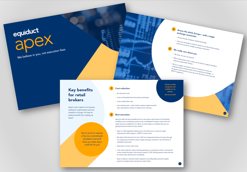
Equiduct have a unique trading platform that helps retail brokers achieve trading Best Execution for their clients without having to pay execution fees.
This innovative offering wasn’t being reflected in their brand which needed to capture their essence and elevate their business to the levels of emerging new Fintechs.
The Moreish Approach
We started by really getting under the skin of the business by speaking to key stakeholders from inside and outside the business including the C-suite, client service, sales, marketing, strategic partners and clients. A clear learning from these sessions was a really clear passion and purpose to lead positive change in the industry.
The historic traditional, safe and indistinctive brand was completely disconnected from Equiduct’s unique, passionate, client-centric and forward-thinking spirit.
In the new brand strategy we:
added clarity to their purpose: ‘Giving the retail market a better way to trade equities in Europe’
refined their values and brand personality to be more challenging towards fighting for better and leading positive change in the industry and to build confidence in their new eco-system
developed a brand manifesto with five key beliefs they deliver on including: ‘We believe in providing the best trading prices, every time’
created a new brand essence and strapline of: ‘The trading venue of tomorrow, today’
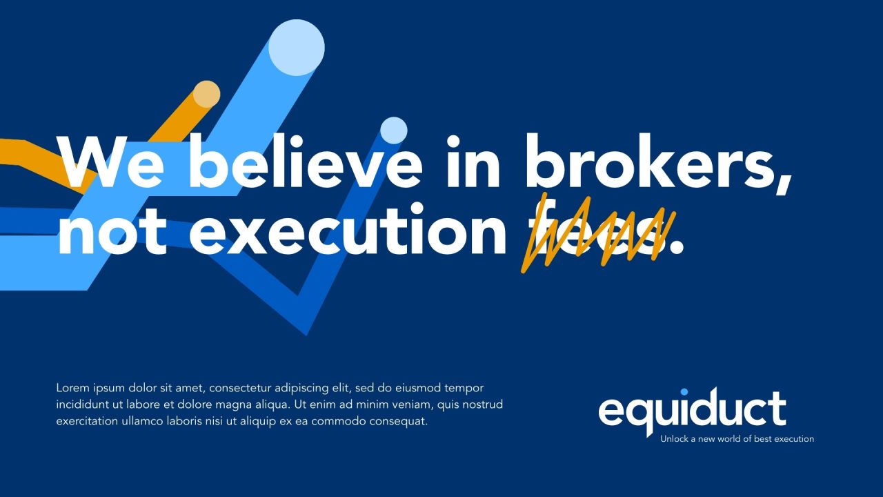
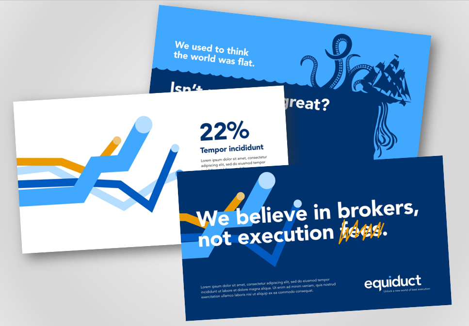
developed a new customer proposition of: ‘We believe in you, not execution fees’
An innovative new brand concept and identity followed seamlessly which now aligns with their now clearly defined purpose and personality.
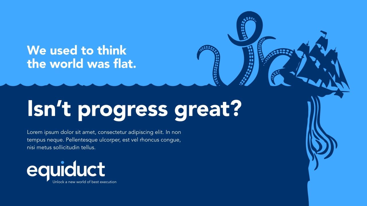
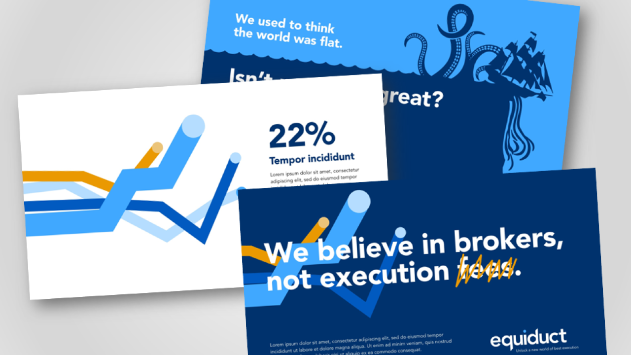
We also incorporated a revolutionary element to the new brand campaign to demonstrate the disruption Equiduct are bringing to the trading industry. Based on our immersion sessions and research, we developed the tagline “Isn’t progress great?”, tying in with their value proposition, and complemented it with new, bold campaign imagery about the way transport and technology has changed over time. This included two new brand animations:
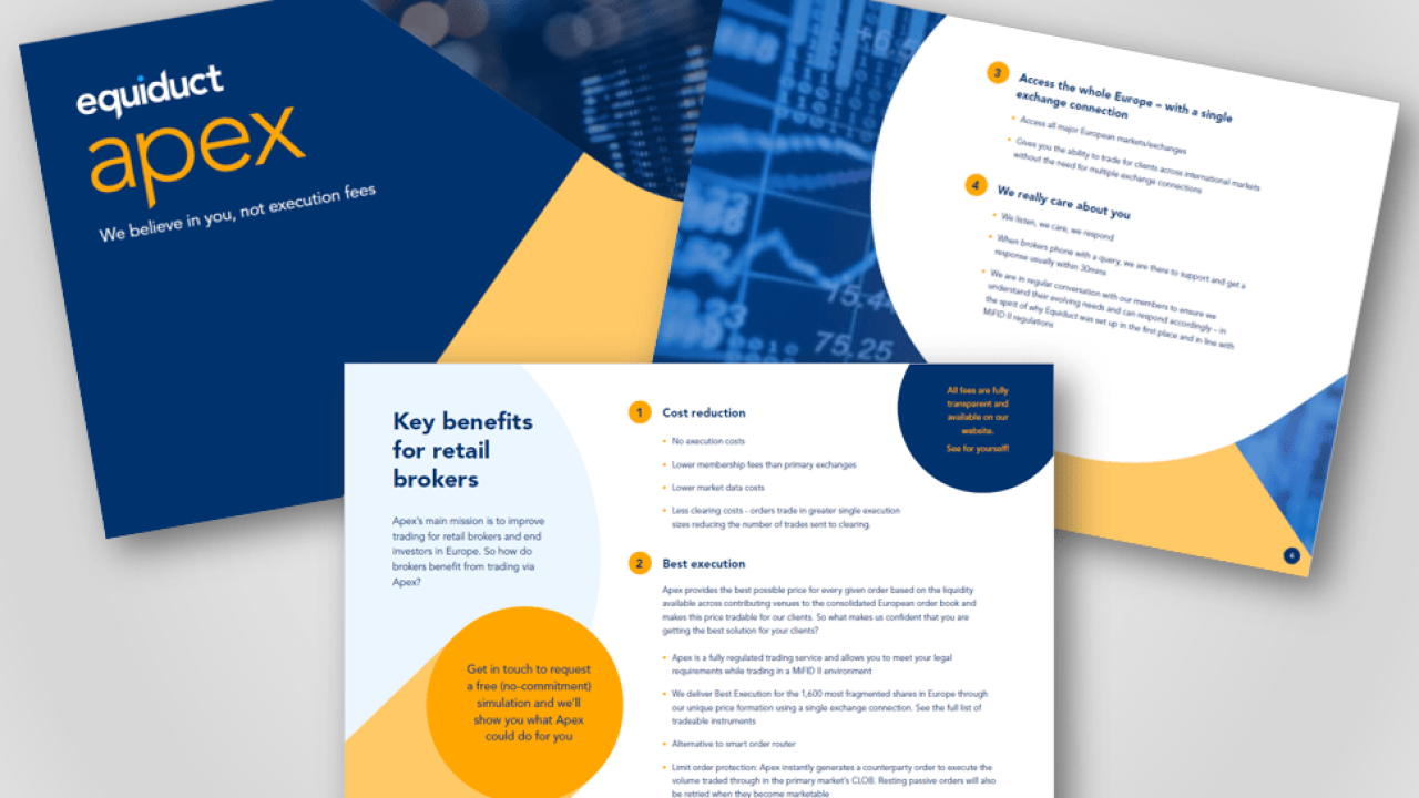
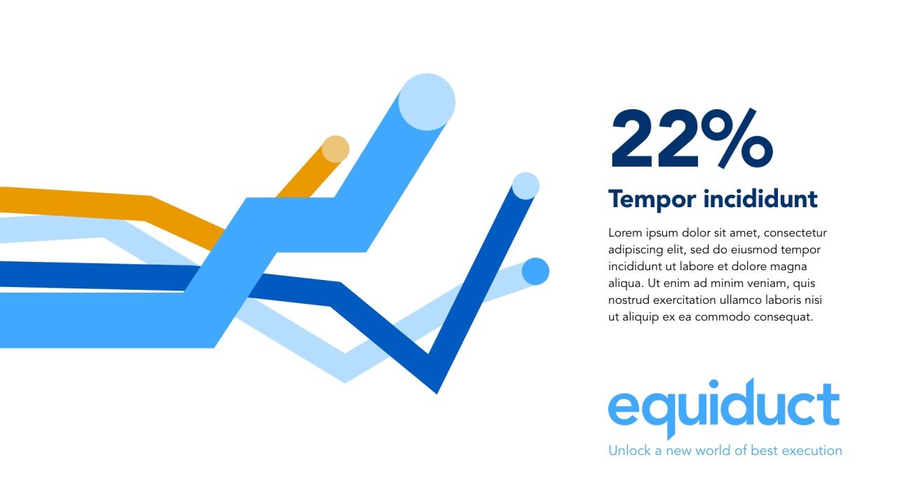
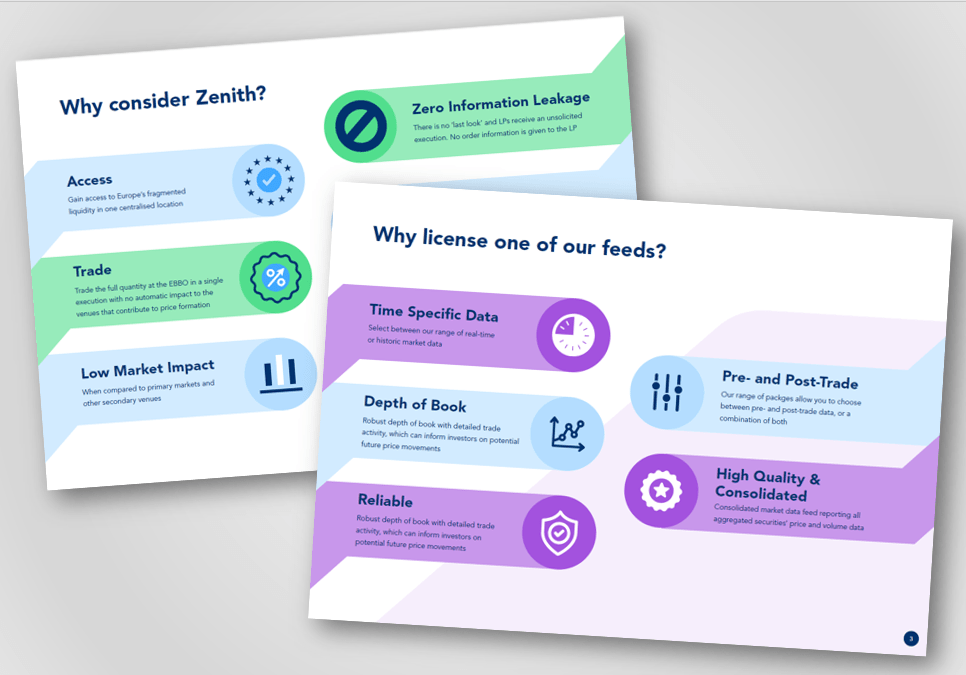
To really bring their products to life, we decided to opt for a cooler, more high-tech blue colour palette, with contrasting accent colours. Equiduct’s three main services now each have their own sub-brand and primary colour. We also created a new brand graphic, designed to reflect the movement of the stock market.
the results
The huge transformation of the brand has added renewed energy from inside and outside the business and supported with the onboarding of four significant new clients, +34.7% in average € Apex Daily Traded Value, a 22.12% growth in their market share and an 18.4% revenue increase.